In Good Health
I am thrilled to share my latest project with you all. I was honoured when Dr. Liz Franqui approached me for assistance with her brand and website design. She has opened a Wellness Space in Komoka, Ontario.
Her unique approach to Chiropractic care and overall wellness immediately caught my attention. Her compassionate, honest, and innovative approach sets her apart from other wellness providers in the industry.
With the opening of her clinic in Komoka, Dr. Liz Franqui is now providing whole-health wellness services through her establishment, In Good Health. Her services include Chiropractic, Massage Therapy, Reiki, and she has established partnerships for Naturopathic and Psychotherapy services.
By optimizing the website design, we aim to highlight the exceptional services and approach of In Good Health, and make it easier for residents of Komoka, Ontario to find and access the care they need.
Client
In Good Health
Location
Komoka, Ontario
Services
Web Design, Brand Identity
My Approach
The Challenge
In Good Health already had a beautiful logo designed by the extremely talented Beth at Fresh Fish Studio. I wanted to expand the brand identity more by extending the colour palette, patterns, styles, and other imagery. I designed some marketing collateral to match this aesthetic.
Liz also required effective web design, where customers could easily find information about the services offered in Komoka. Clients also needed to easily book an appointment online.
In Good Health was looking for web design that was clean, modern, approachable, but a bit bold, with a touch of earthy. I wanted to emphasize what stands out about this all-encompassing wellness space through specific placement of the written copy.
Brand Collateral
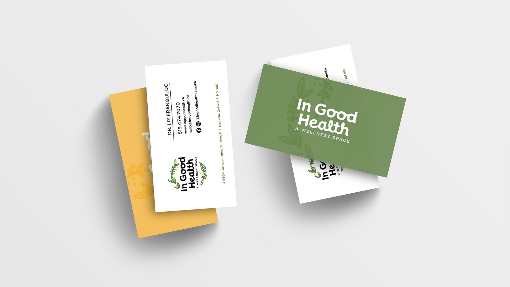
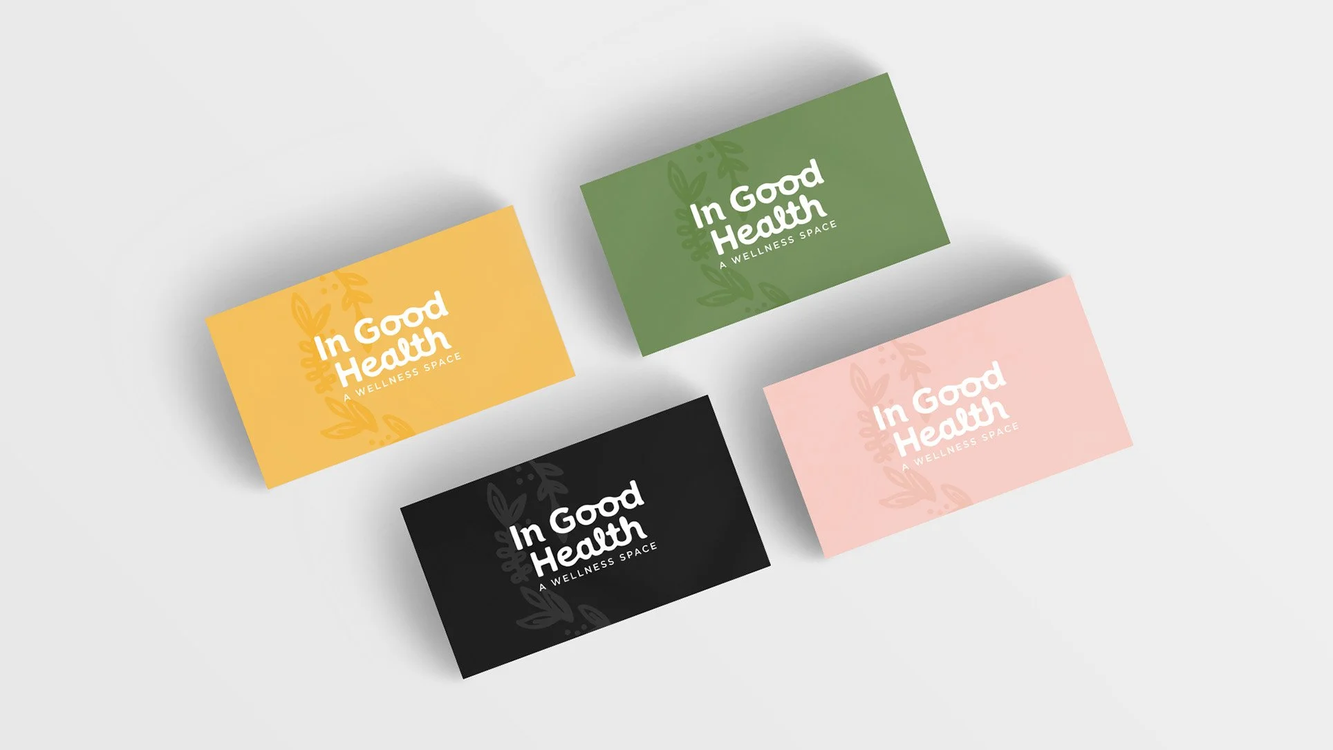
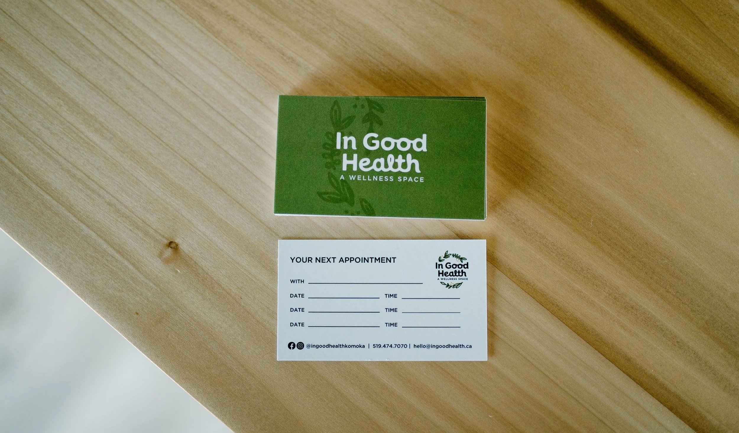
Here is a little preview of the In Good Health business cards I designed. The colour palette is earthy, yet striking. The typography is modern and welcoming. Each practitioner has a different colour on the back of the card.
Website Design
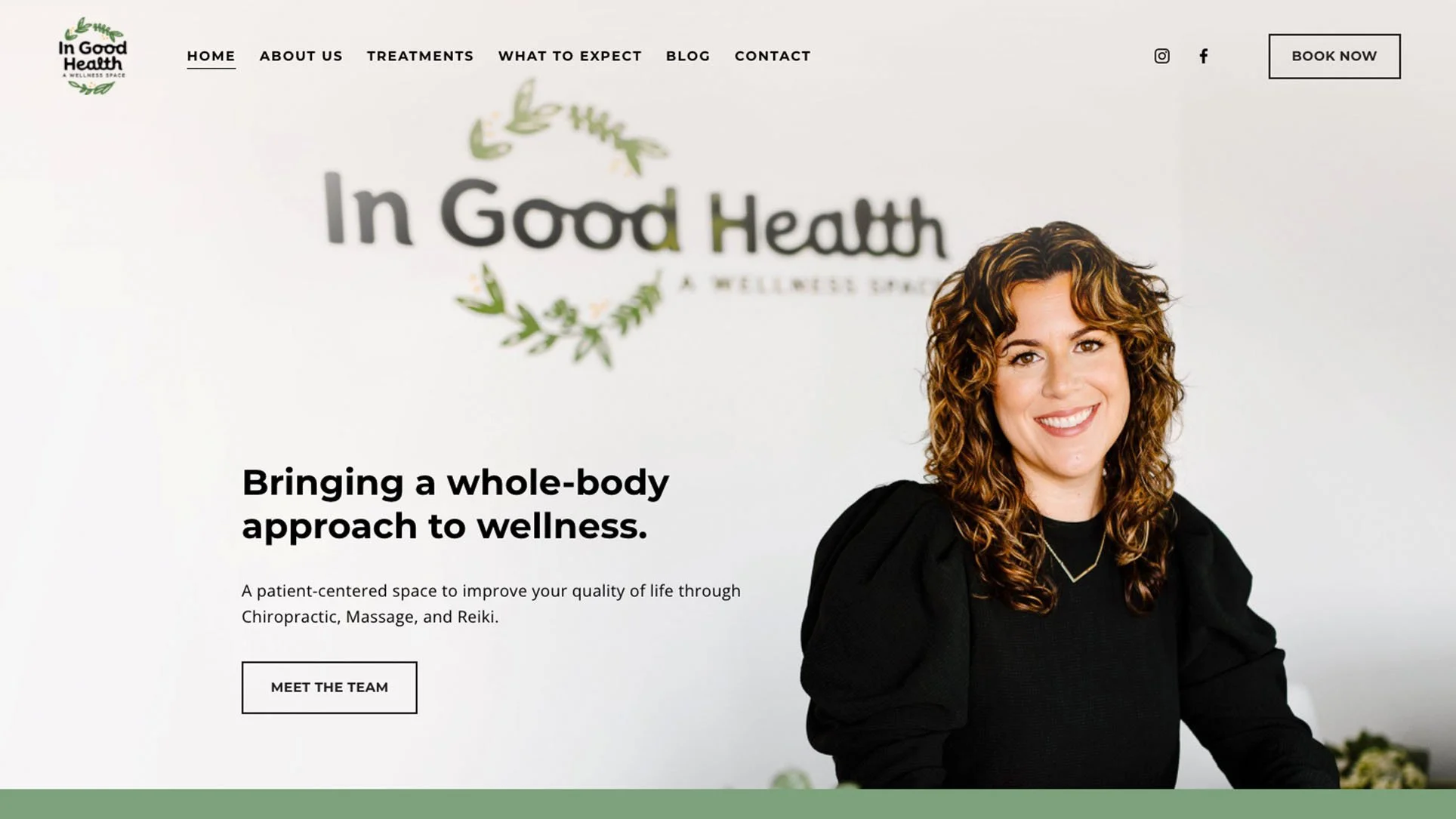
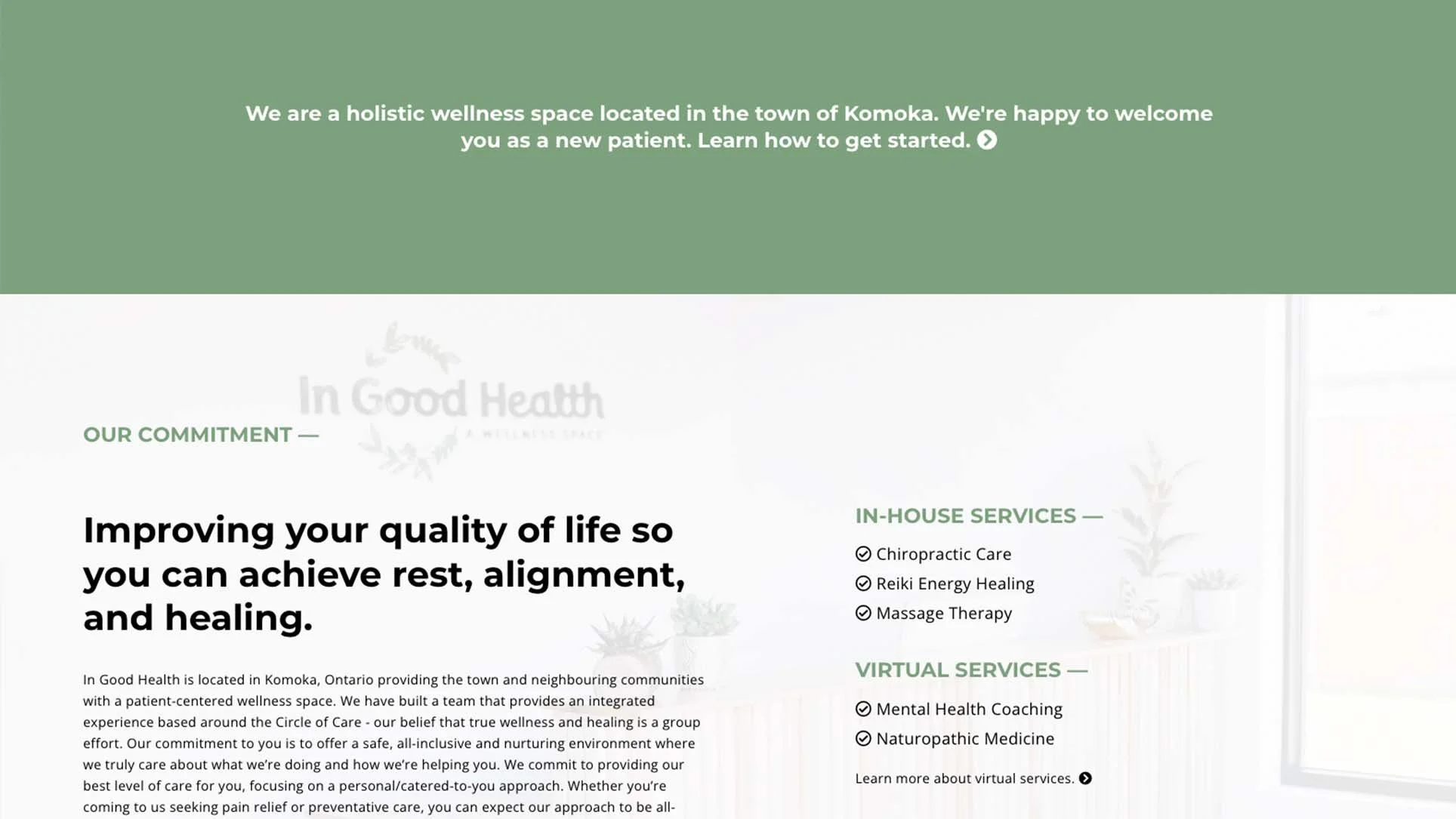
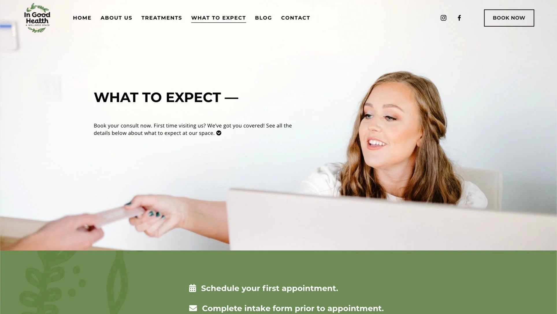
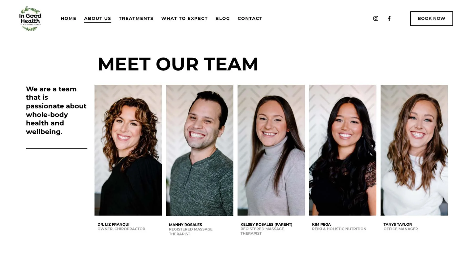
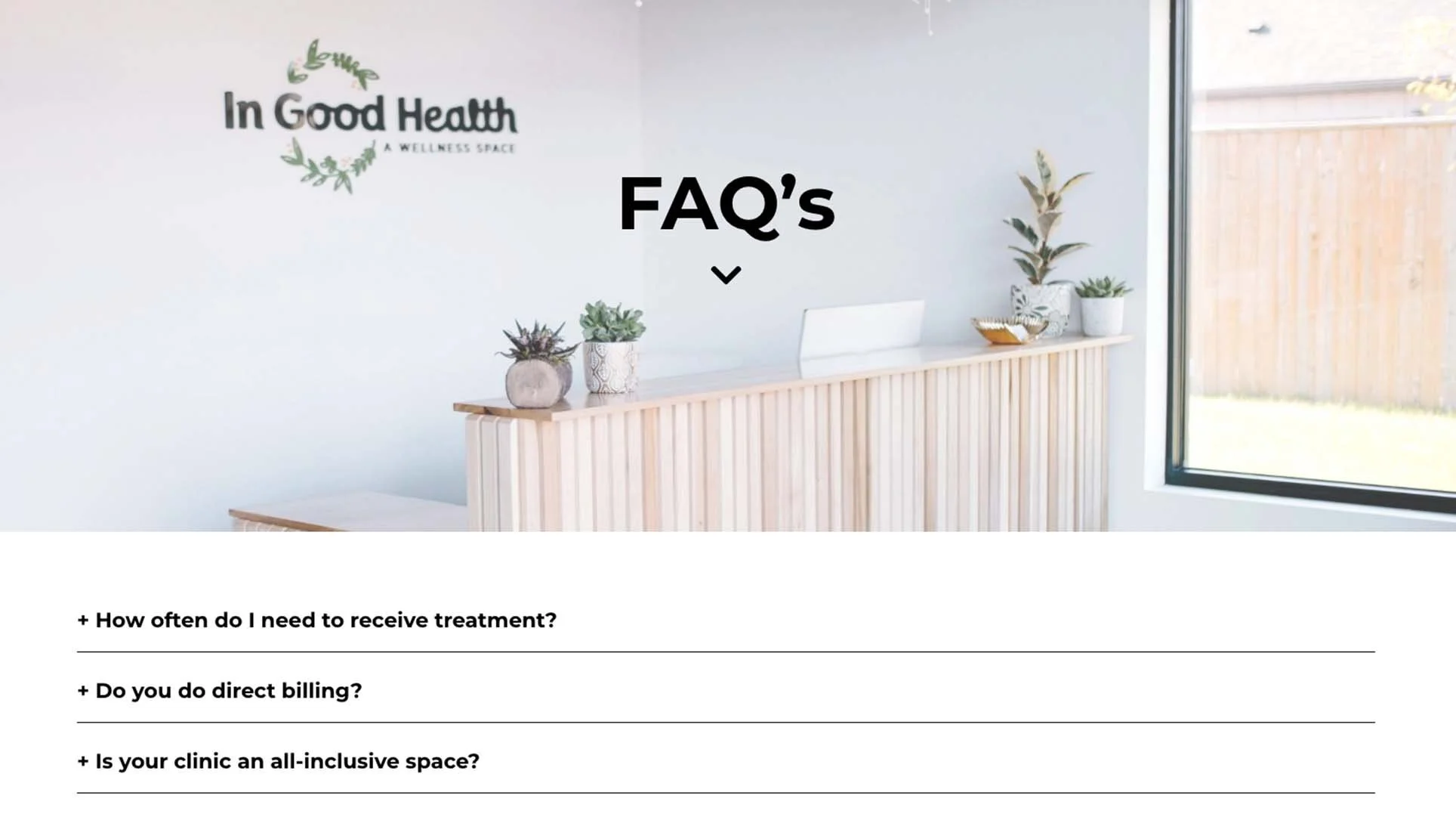
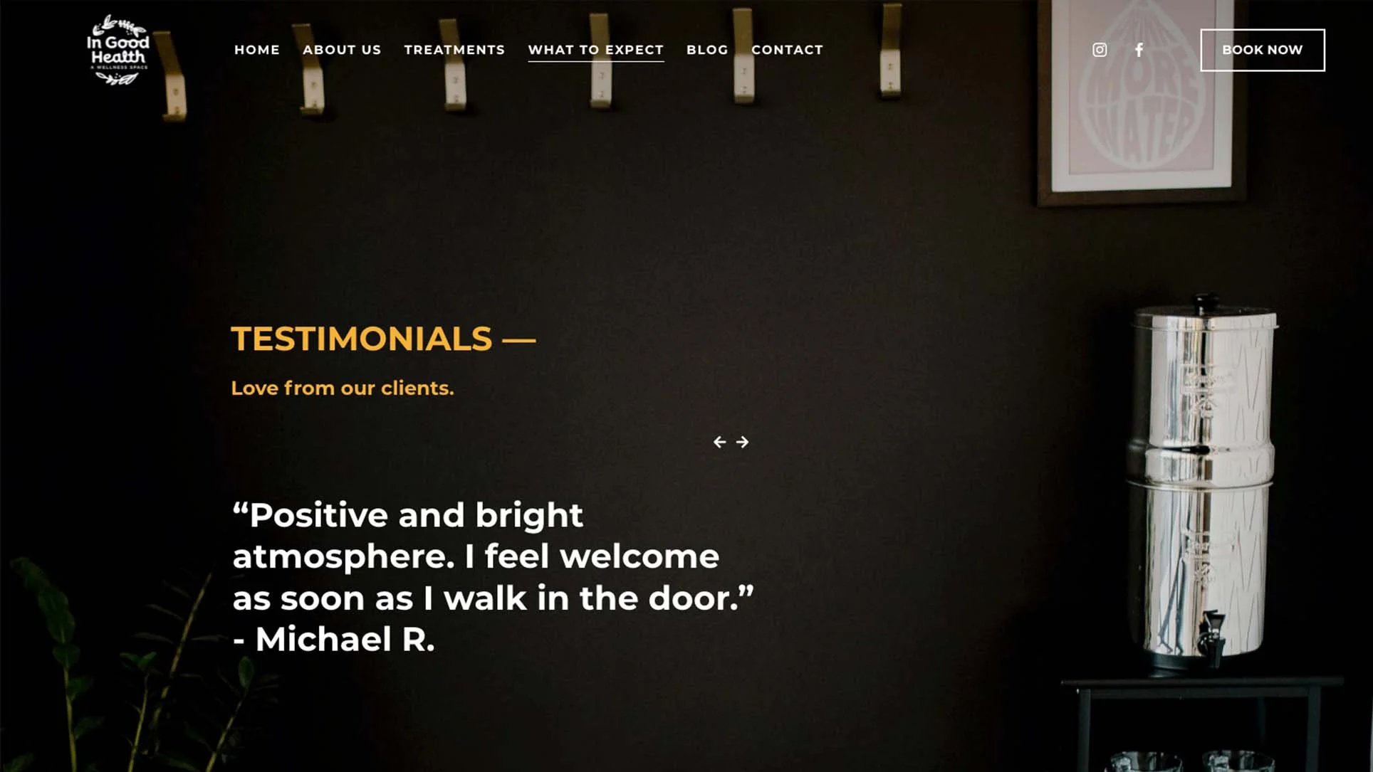
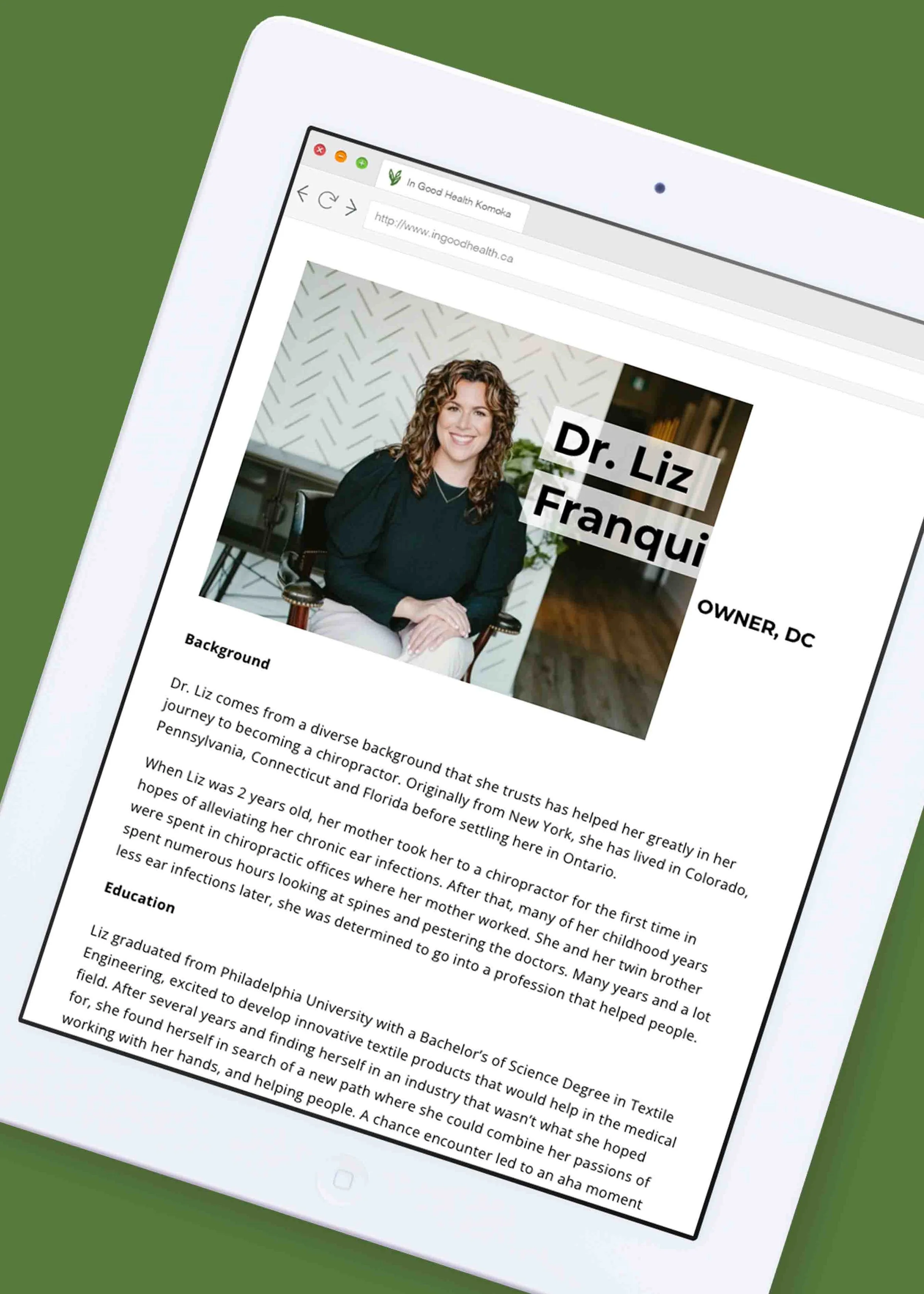
The In Good Health website allows users to easily access treatment information, view the team, and access the online booking system through Jane. The many beautiful photographs of these stunning ladies (and gents) are by the very talented Thistle and Rose Photography. A web design truly shines with professional photography.
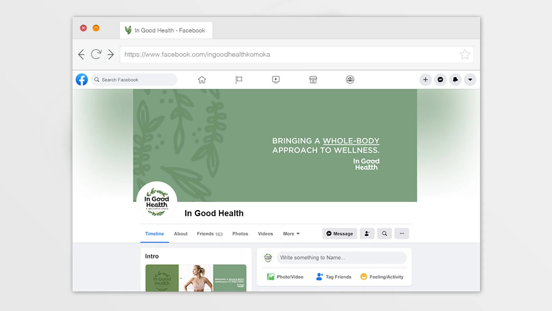
It was important to tie in the branding and overall aesthetic into the web design. I think the graphics, fonts, colours, and photography all really tie in well together to bring this space to life.
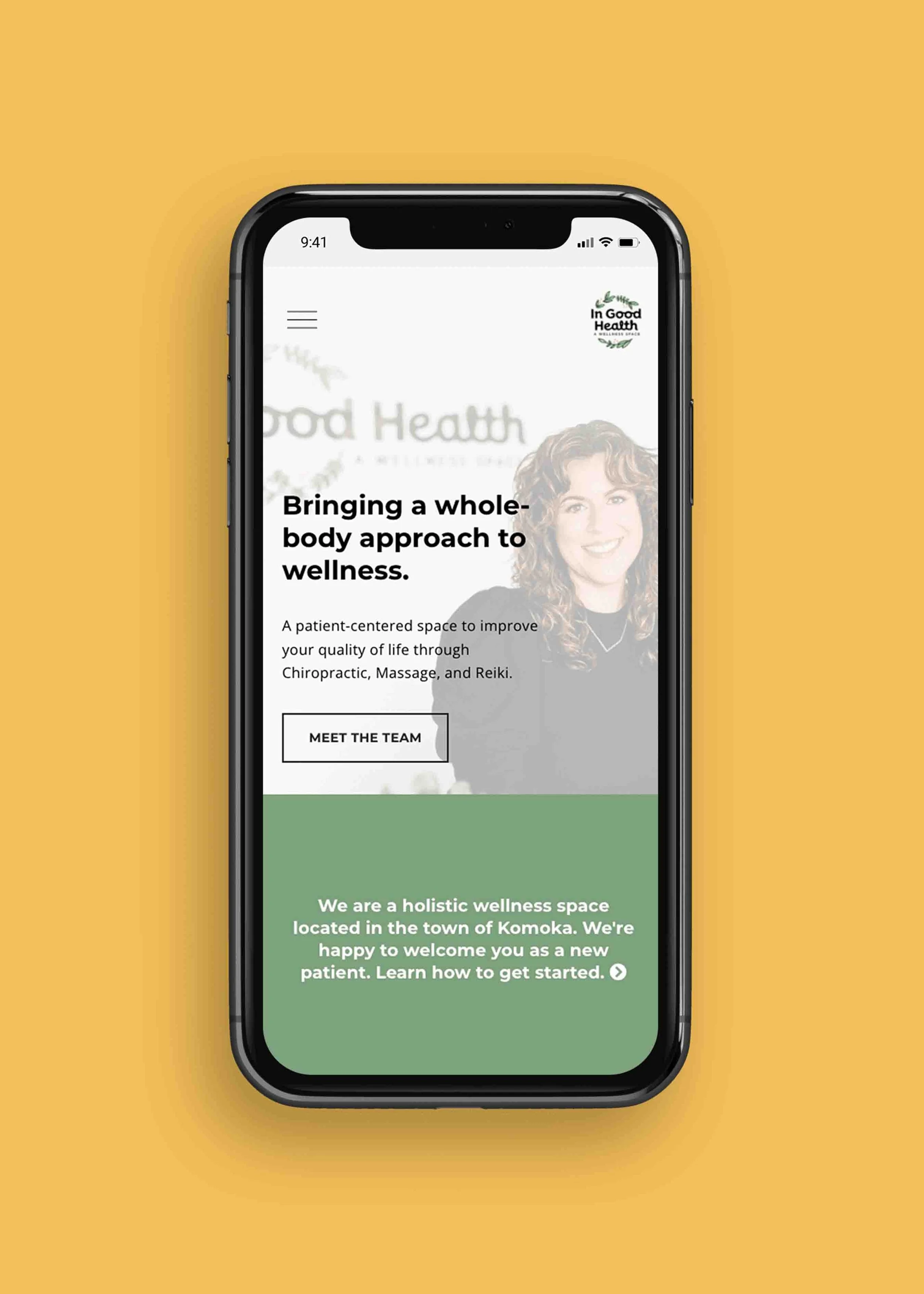
Next are some responsive versions of the site. The placement and sizing of the text and photos adjusts for different size screens. This helps with usability, and will keep mobile users on the site. Check out the new website here.
See a video walk-through of the website below. View the full website by clicking here.
I really had a wonderful experience collaborating with Liz on this project because of her dedication and commitment to helping people. It’s always great to partner with people who are truly passionate about their work. If you’re in the Komoka or West London area, definitely check out this wonderful space.
“Mel is so wonderful to work with! She is personable, detail-oriented, and worked hard to get to know who we are and what we wanted to portray. She wanted to understand the feeling/vibe/energy/voice/tone that was "In Good Health". She really listens to you, is patient (which was huge for us!), she is thorough, knowledgeable, offers guidance, and puts in time to get to know your business and your visions. She makes sure that you understand what is being done & why, how to do some things yourself, and provides you with resources. We were and still are so happy that we found her and worked with her when setting up our website and social media - as well as our business cards, etc when In Good Health opened last year. She is still our go-to, and in fact, I'll be emailing her right after this posts! The fact that we trust her and feel her support makes us lifelong cheerleaders for Mel Groulx. HIGHLY RECOMMEND!” - Tanys Taylor & Liz Franqui, In Good Health

