Behaviour Avenues
I was happy when Lina reached out to me to create an autism and behavioural services logo and website for Behaviour Avenues. Children definitely need more support in this area, so I know her services will be valuable to many families. I explored her branding, and designed a new website for this ABA service based in London, Ontario.
Lina works as not only a support for children, but a coach to the parents and family. She does individualized assessments and chooses treatment unique to each child. She wanted to reflect these ideas in her logo.
To symbolize the many pathways available to each child. Every child succeeds in different ways, and Behaviour Avenues is the support system that helps implements these pathways.
Client
Behaviour Avenues
Location
London, Ontario
Services
Brand Identity, Logo, Web Design
My Approach
Lina challenged me to convey the many pathways for children when I created the logo, branding, and website.
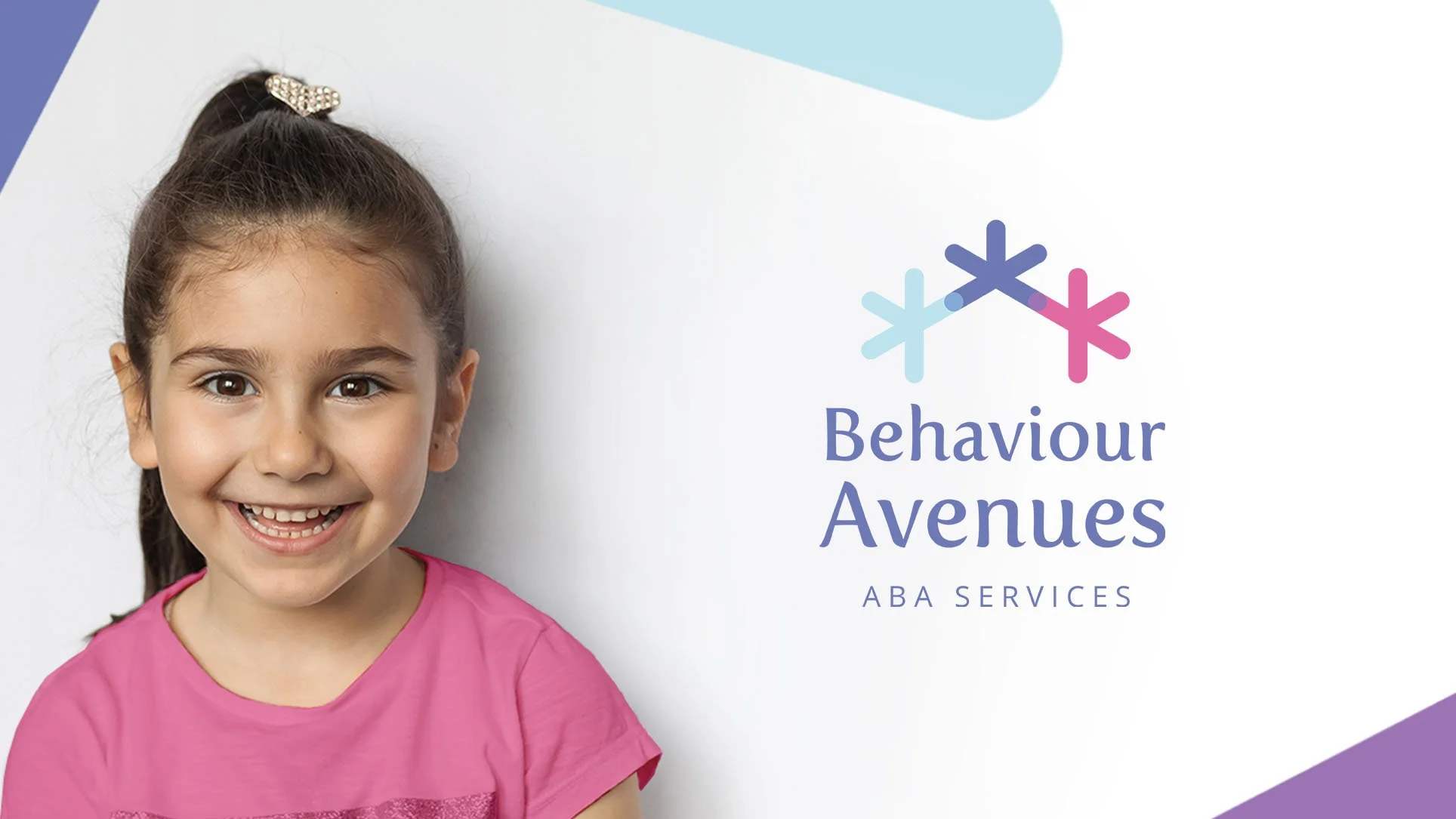
I created a logo that was welcoming, friendly and created a sense of trust. I integrated the pathways concept through the various shapes that go outward in many directions. The lines form the shape of a house, which represents the foundation or support system that is provided by Behaviour Avenues. Similarly, when creating the visuals, I wanted the brand to appear approachable and gentle. I used soft, round edges and overlaid tones of purple, blue, and pink. The typography has gentle serifs which make it very welcoming.
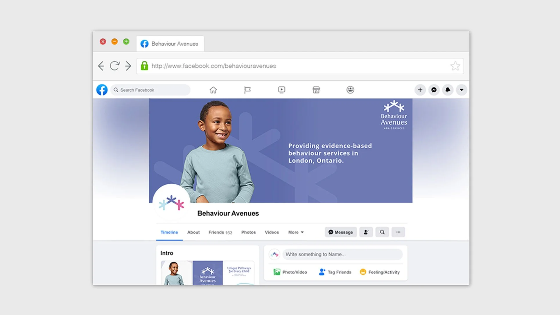
In addition, I designed social media graphics that matched this tone. Lastly, the development of the website really brought together a cohesive brand identity that is welcoming, trustworthy, and professional.
Logo & Brand Design
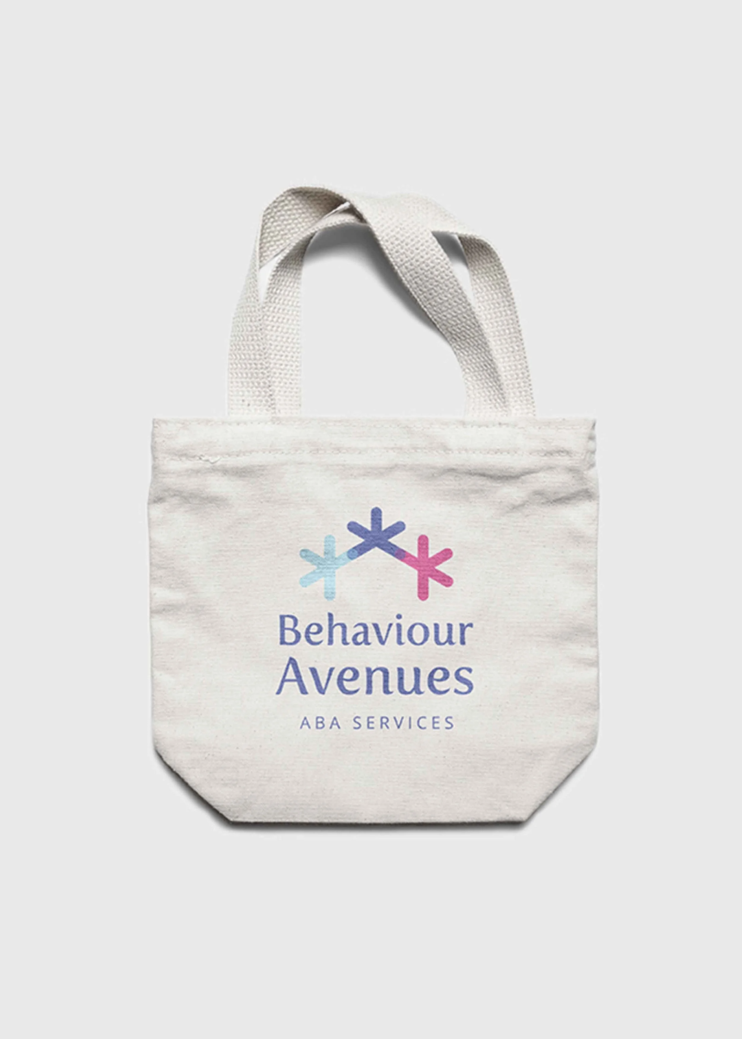
Below is the logo I designed for Behaviour Avenues. It has a gentle aesthetic, while integrating the concept of many pathways of learning. The icon shows the many unique directions of treatment that Lina can use, individual to each child. All of this is shaped into a house, a safe space, and Behaviour Avenues is the “foundation” or support system for children. The typography is friendly looking with soft edges to add to an accepting and welcoming vibe. The colour palette is friendly and calm but also represents dependability and trust.
Website Design
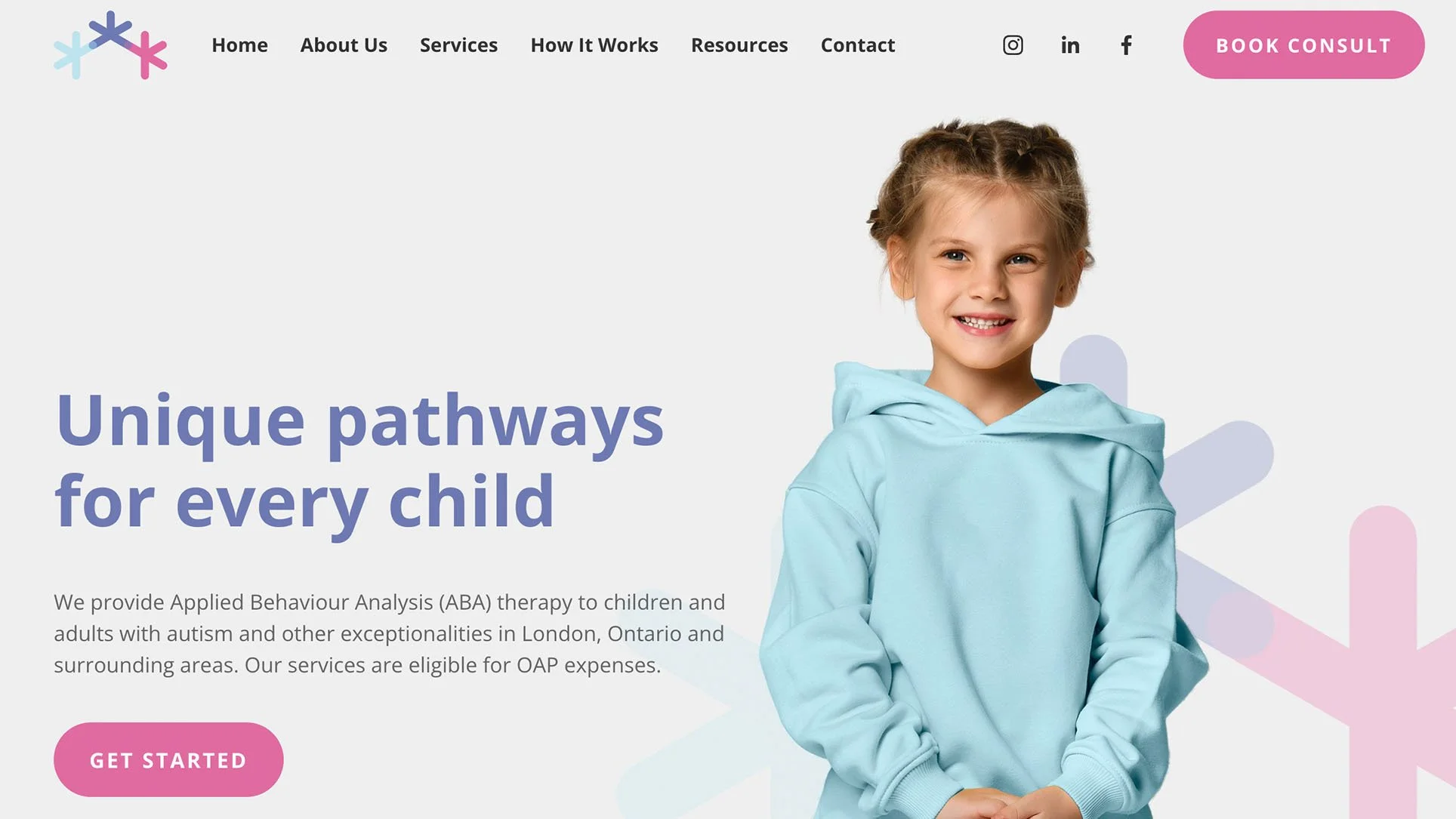
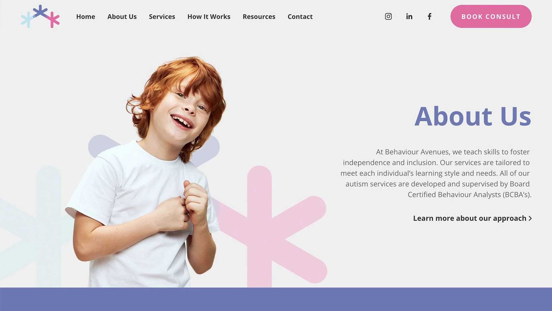
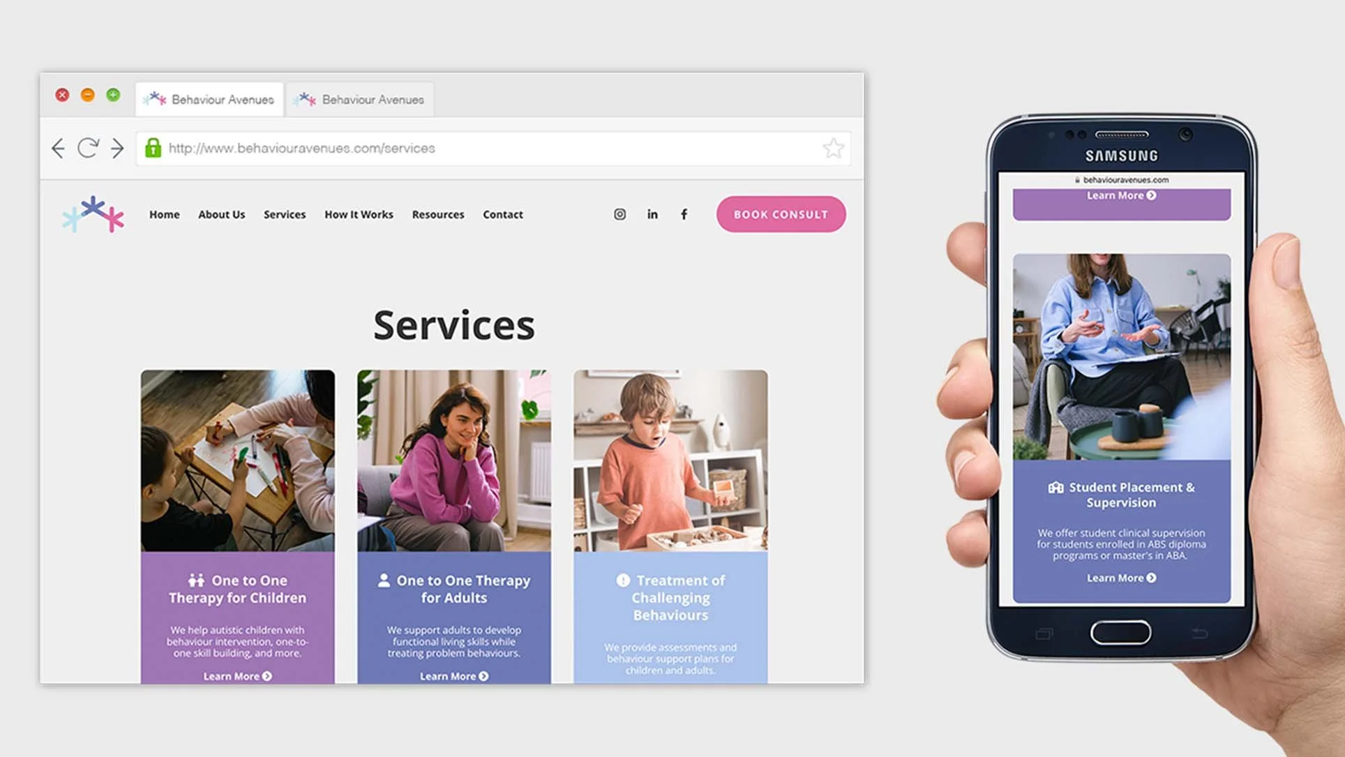
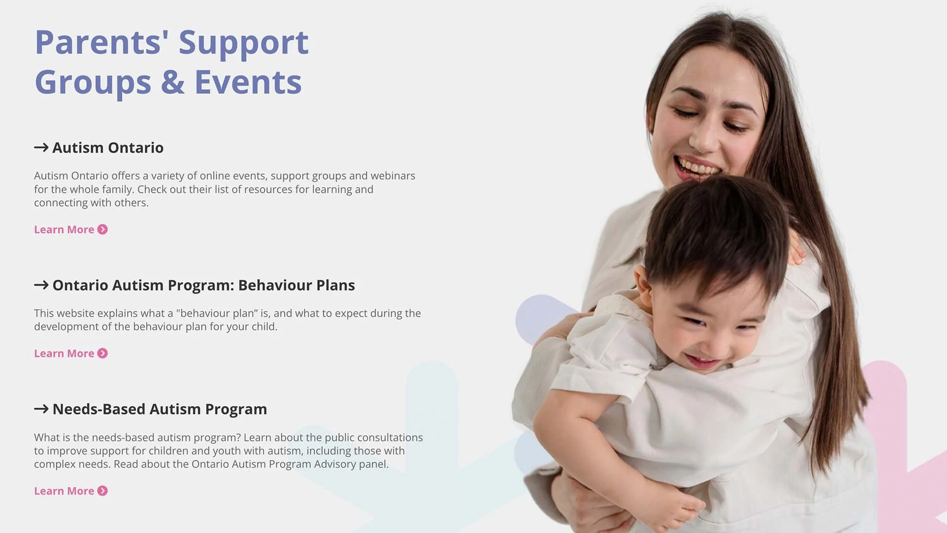
After Lina got her initial business plans up and running, we were able to start planning her website. Below I’ve featured some shots of the final website design, with some examples of responsive web pages for mobile and tablet formats.
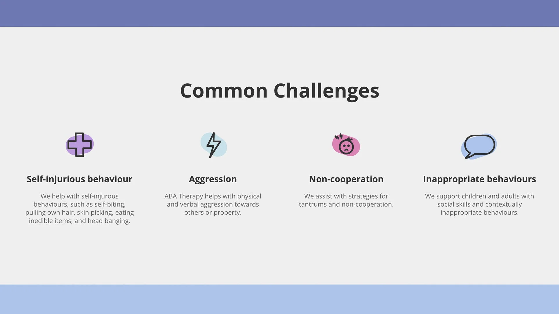
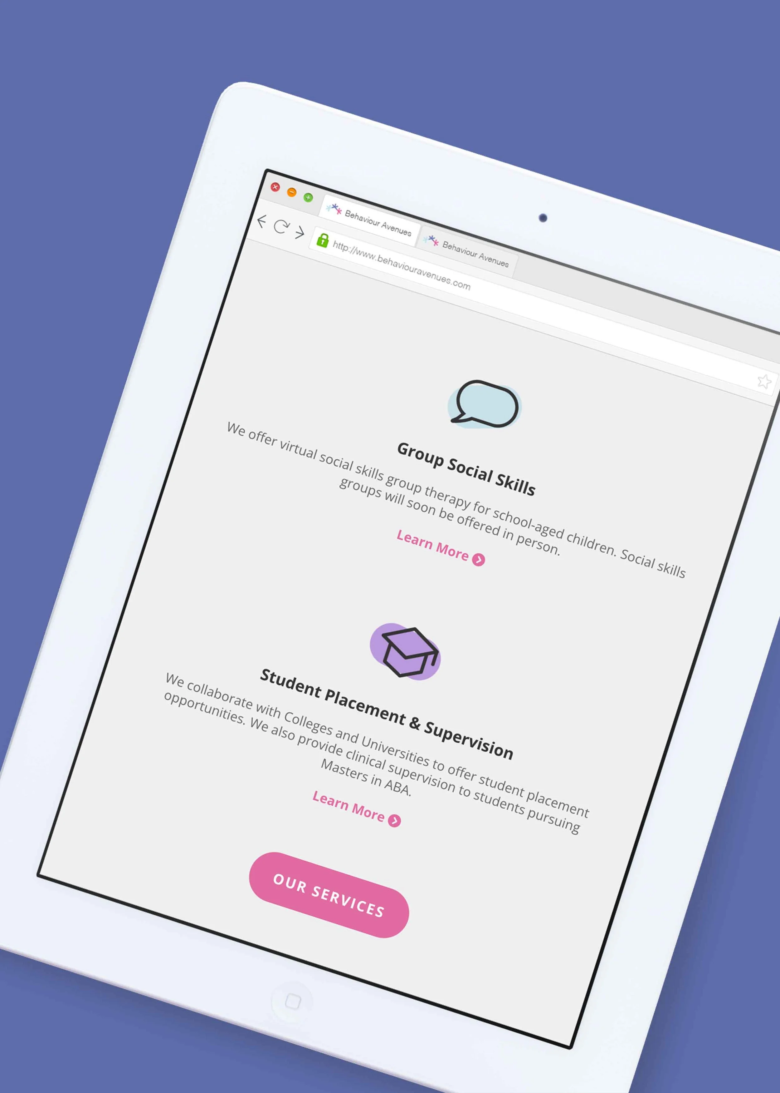
Throughout the website, I designed custom icons that add to the calm, welcoming look for children and families. These icons complement the logo and integrate the brand’s colour palette. They can be used throughout social media or other marketing materials to maintain brand recognition. Next is an example of a responsive layout. This shows how the website previews differently on tablet, and mobile. This helps with usability, making the website clean and simple to use.
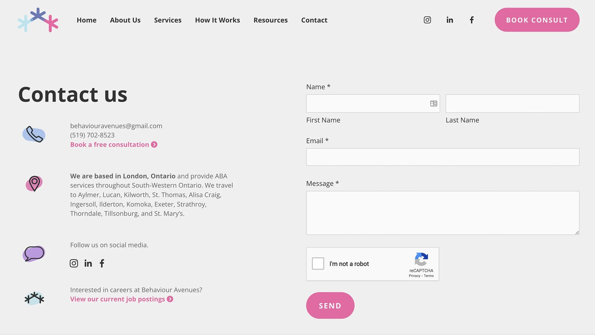
In addition to some custom icons on the Contact page, there is also a contact form and a booking form for clients to reach out and schedule a free consultation. View the full website by clicking here.
Social Media
Next, I’ve featured some social media graphics to match the brand identity. Using branded imagery will help Behaviour Avenues be easily recognized online across all platforms, and help families get a feel for the values of the business.
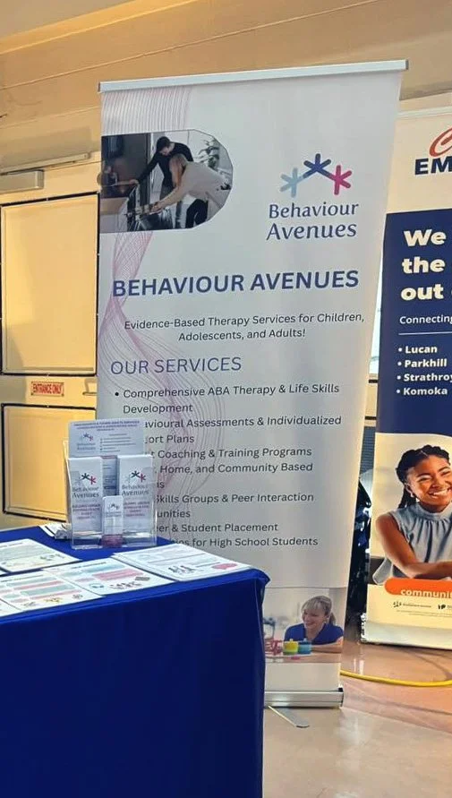
Behaviour Avenues logo in the wild
Launching the Brand
The development of the website really brought together a cohesive brand identity that is welcoming, trustworthy, and professional. It’s always amazing to see a project through from brand strategy, to logo concepts, to full branding and website. See a video preview of the home page below, or view the full website here.
“I reached out to Mel for my business website a few months ago. Mel was amazing with getting to know more about my business in order to come up with her vision and recommendations about the design and the layout. I trusted Mel with her recommendations and I am very happy with the end result. I loved working with Mel and will definitely reach out if I needed in the future.” - Lina Hawi, Behaviour Avenues

