My Approach
Jason challenged me to create a fun, bold developer logo and brand identity that integrates code or development symbols. I took inspiration from Jason’s interest in skateboard brands and graffiti-style design. We wanted the branding to be edgy, informal, and fun.
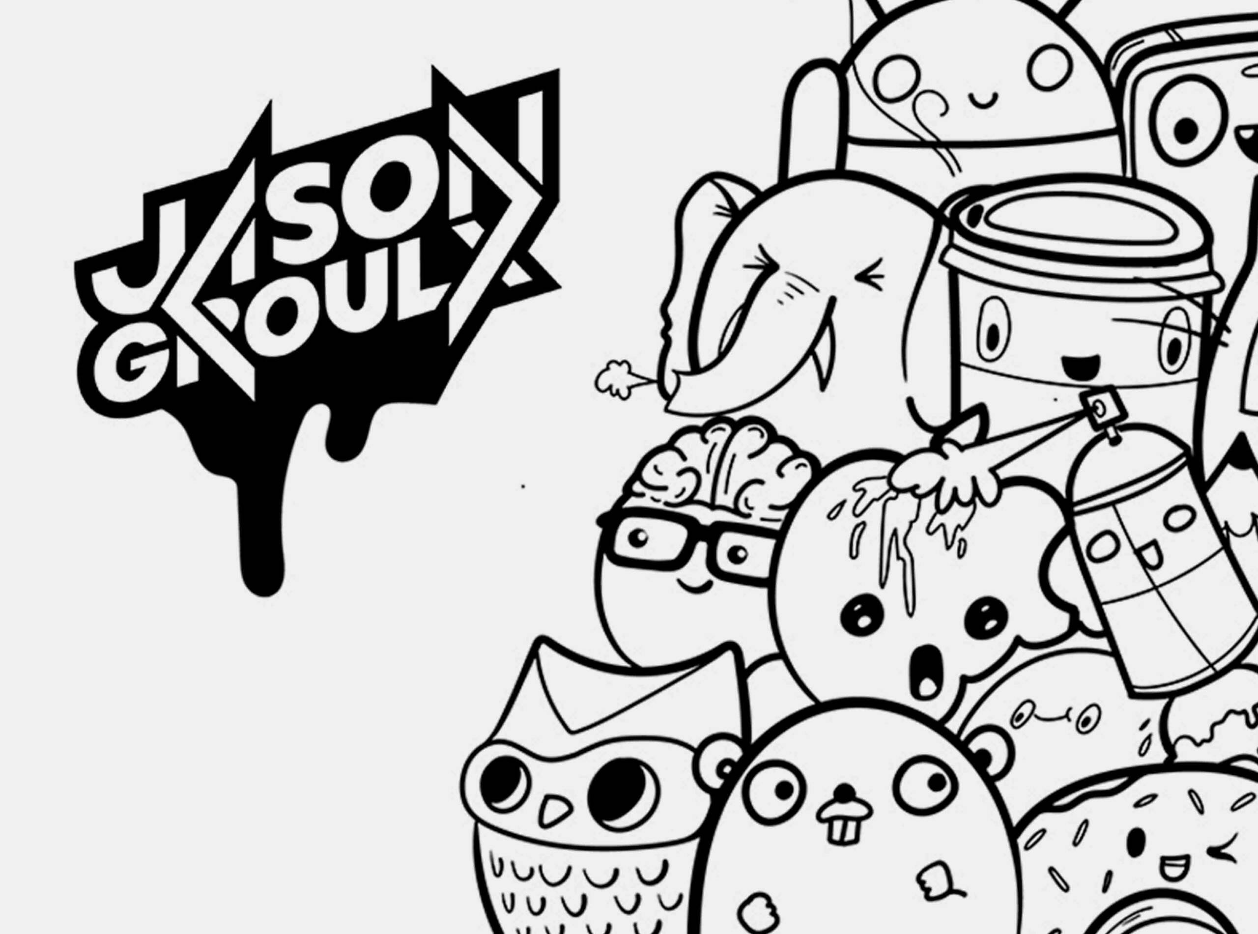
Additionally, when creating the visuals I wanted to create a fun, edgy vibe by using hand-drawn graffiti-inspired characters. The bright turquoise and coral red palette is vibrant and creates a fun aesthetic. It was important to avoid anything overly formal or serious, but rather look more approachable. To start, I sketched out many different logo concepts that integrated coding symbols, and we decided on a concept that integrated the angle brackets (<>). I also drew inspiration from skateboard brand stickers, which work well with the edgy vibe.
BRAND IDENTITY
This is the finalized Styleboard (like a moodboard), which is where the branding process started. I took different colours, patterns, fonts and design elements which would be the foundation of the brand style development going forward.
Further, I’ve included samples from the Brand Style Guide, which is essentially a rulebook about everything that contributes to the brand identity. It outlines the proper use of the logo, cartoons, fonts, colour palette and more. The characters were hand-drawn on my drawing tablet using Adobe Illustrator. Programming languages or concepts, such as the Github Octocat, Ruby, the Docker whale, Android, Apple, and more, inspire most characters. I’ll definitely be expanding on the characters in the future.
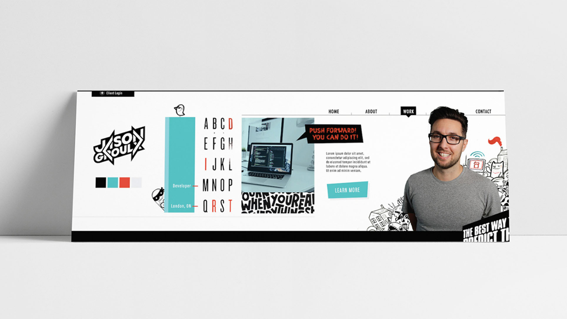

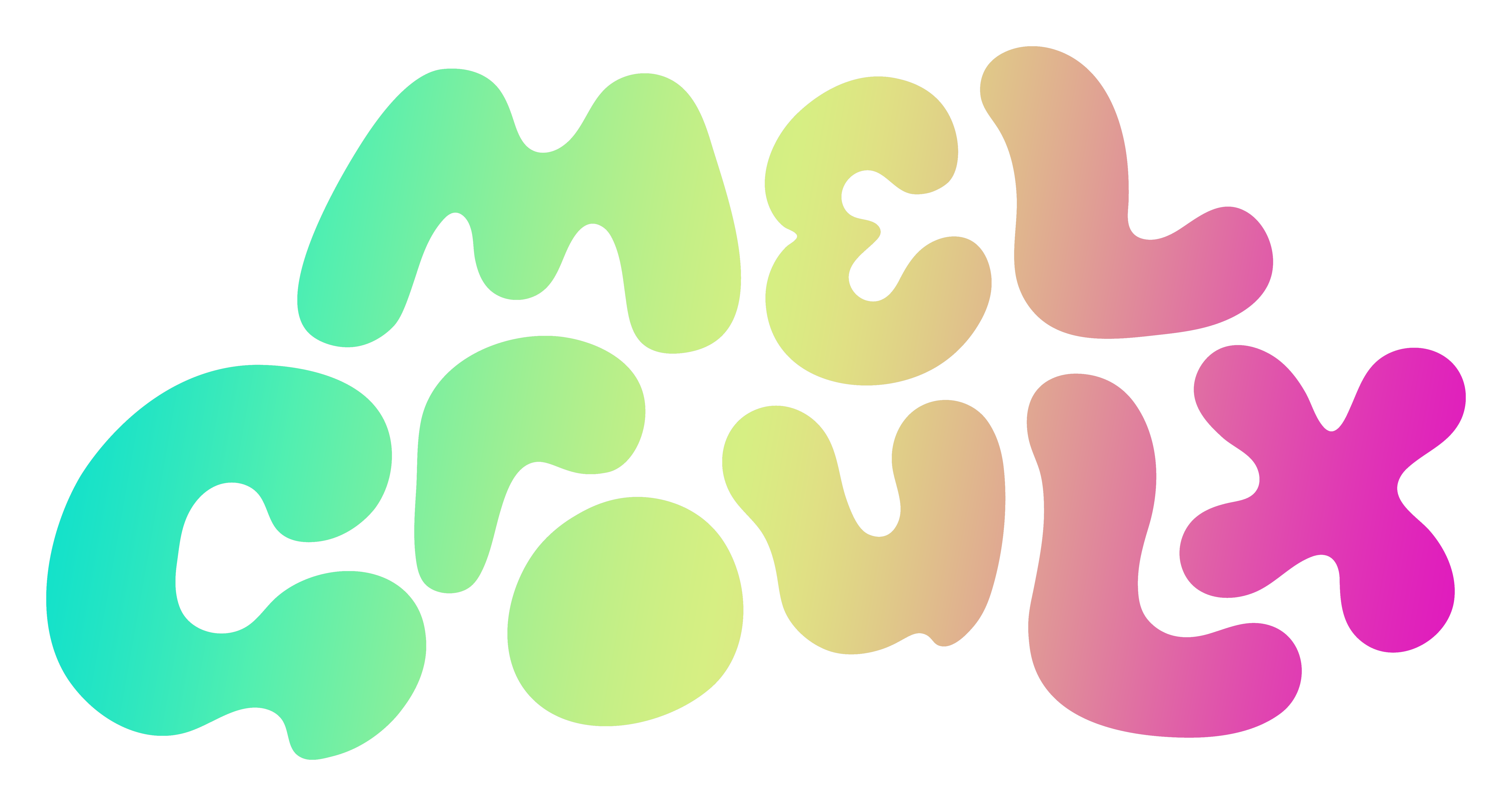
I wanted to draw some attention to the developer logo that I designed. I drew this type by hand and integrated the angle brackets into the A, N, R and X. It is a modern, bold, sans-serif font that almost looks like it’s in motion and angled upward. It has a sticker look, that is similar to a lot of skateboard branding and graffiti-style art. Above all, the logo and branding is appealing to the target market which is mainly developers which tend to be men, aged 20-45.
The business cards add to the graffiti vibes with the paint splatter designs. Two versions of the card offer both brand colors, turquoise and red. This colour palette is vibrant and bold, creating excitement and confidence.

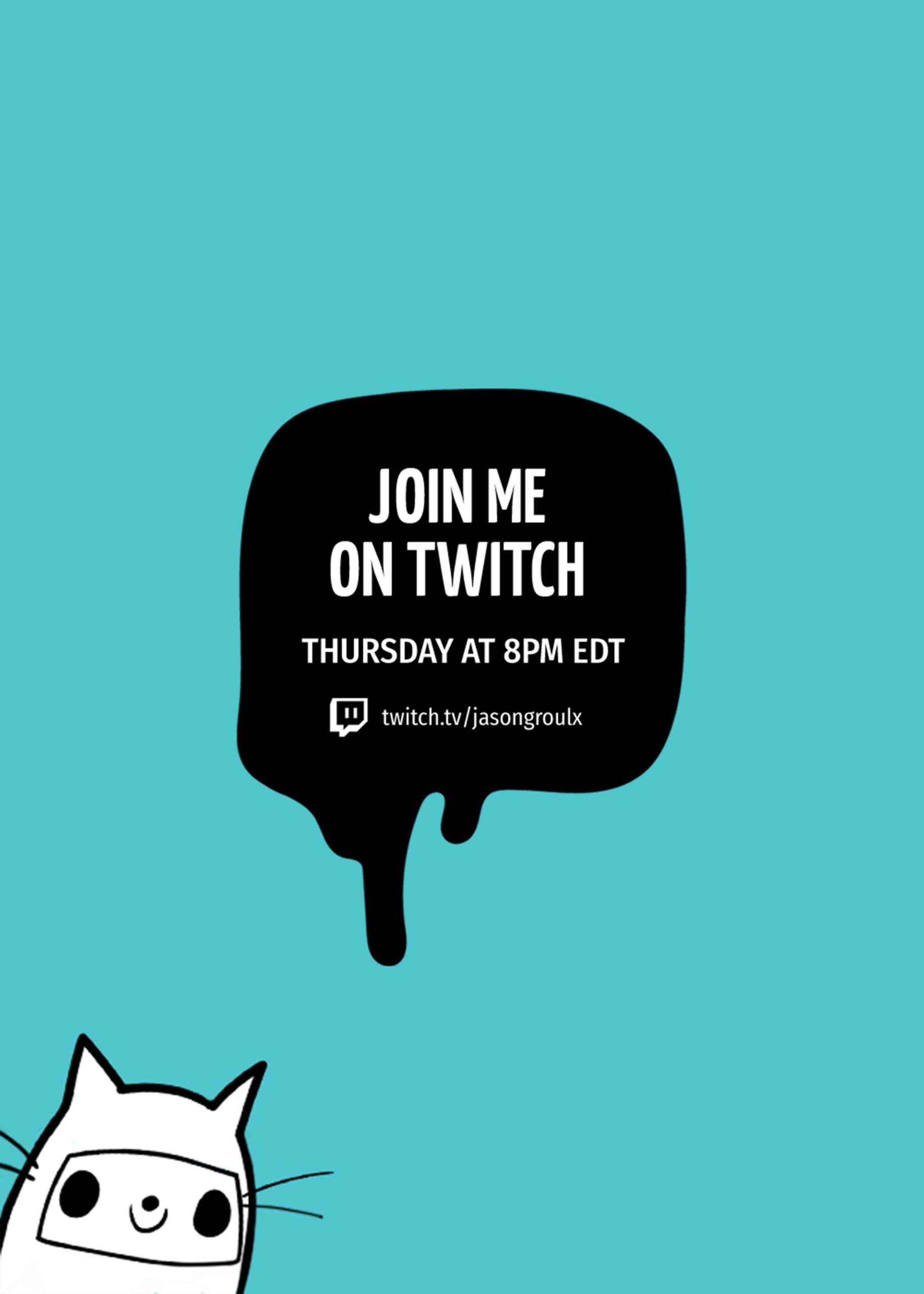
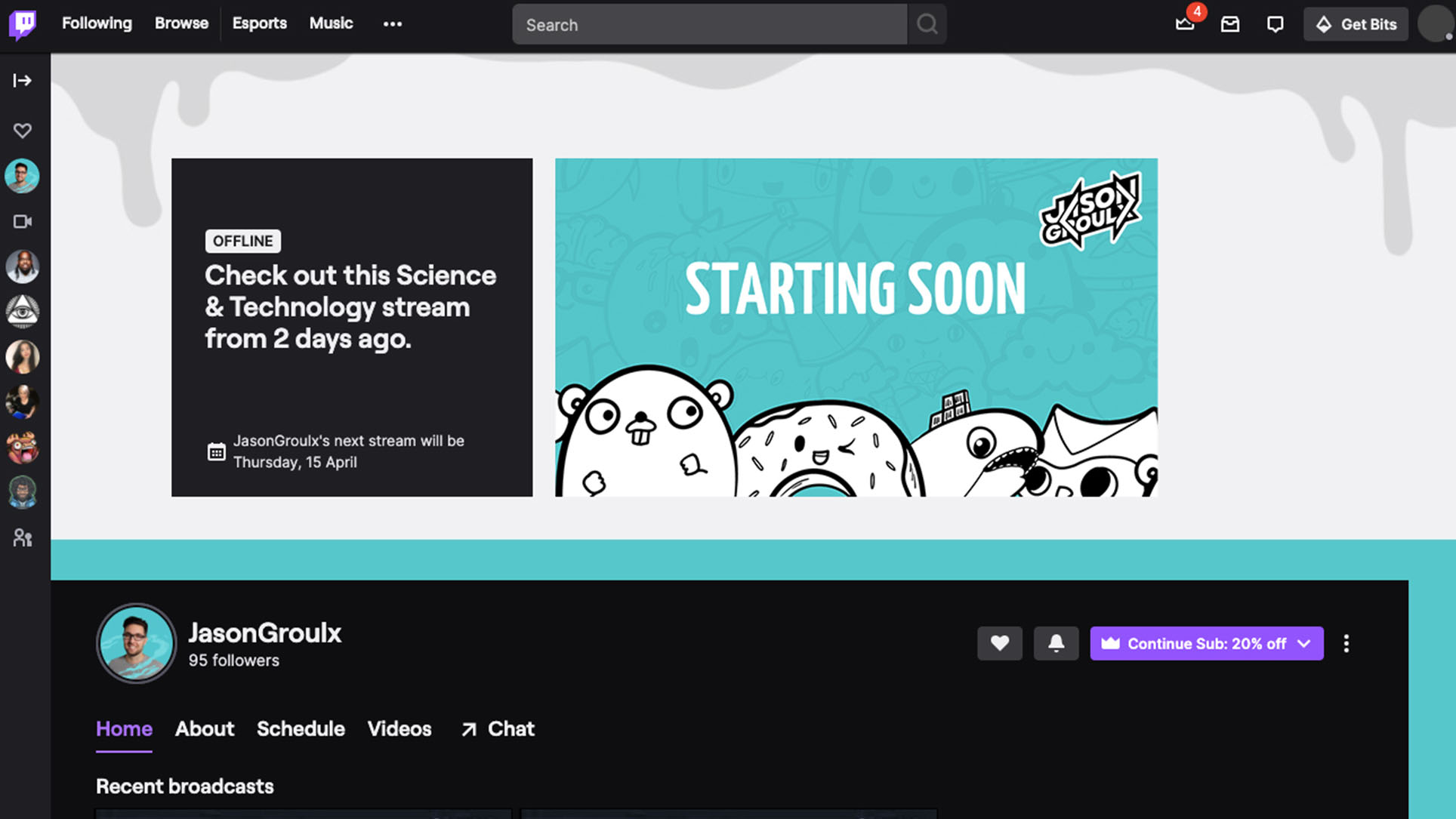
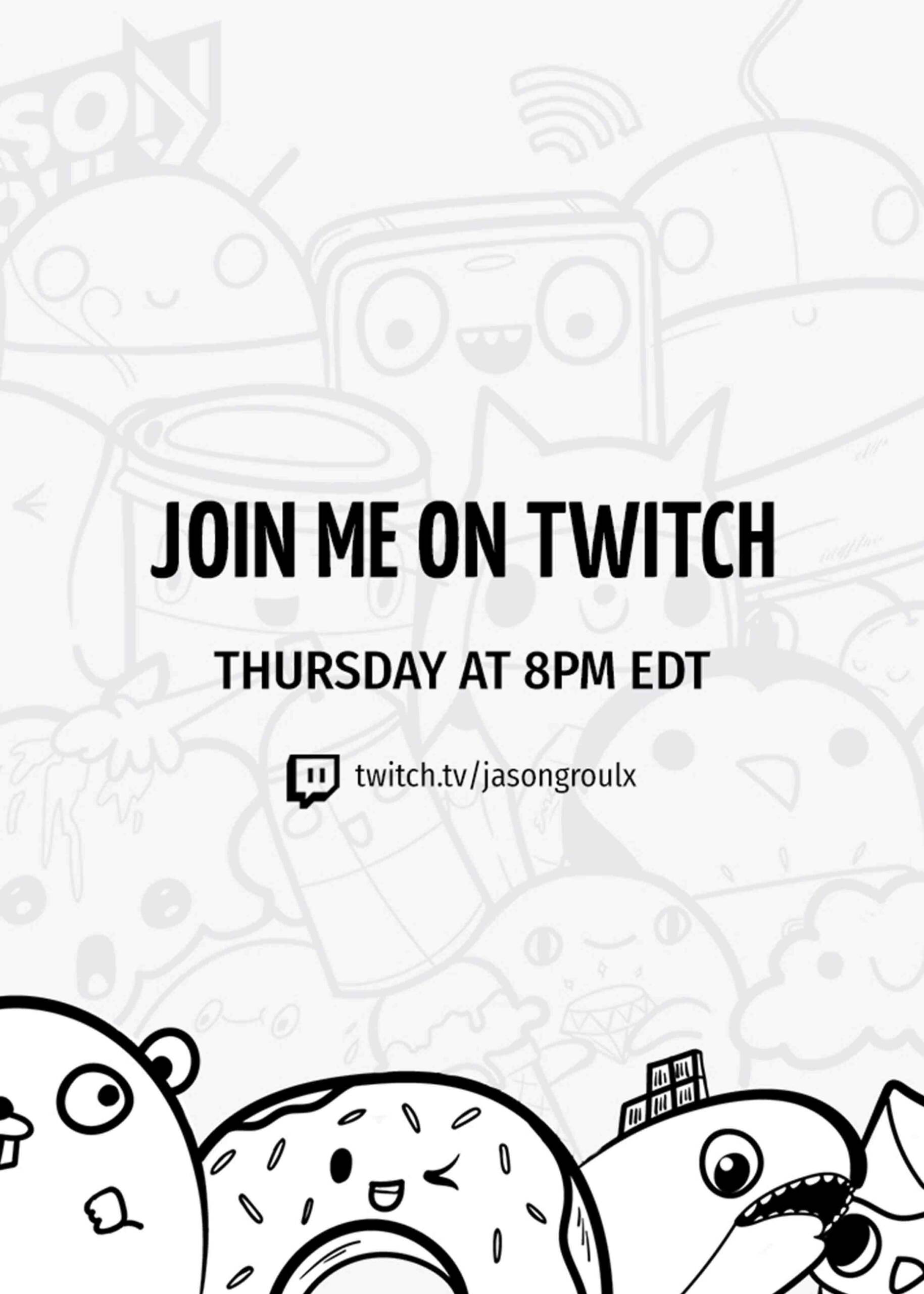
Next, I’ve featured the Twitch profile design which create brand consistency across all platforms. The Twitch cover, video player, and colours are customized. These platforms create brand recognition for Jason’s followers. The images are designed to be legible and usable on all device sizes. Follow Jason Groulx on Twitter or Twitch!
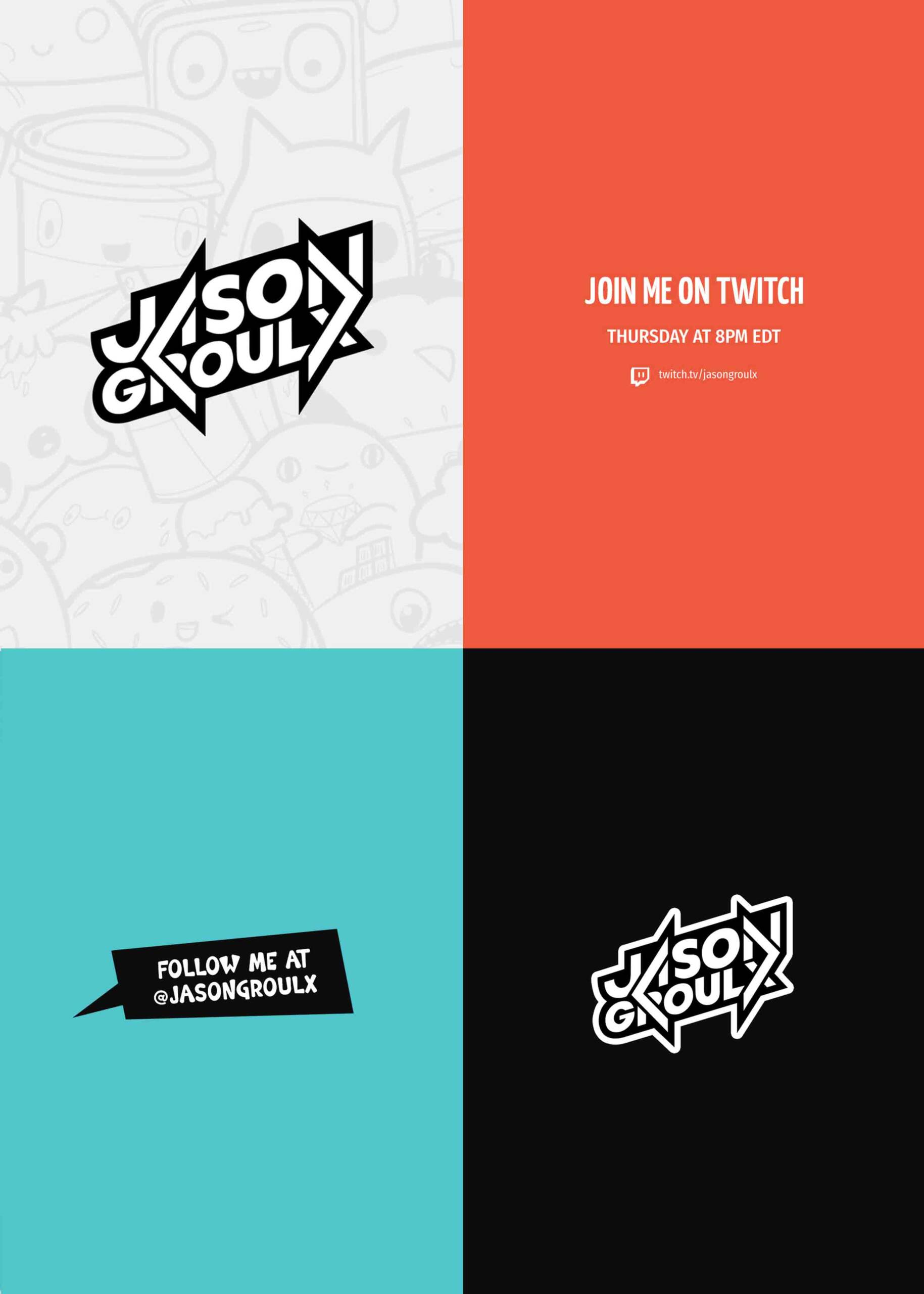
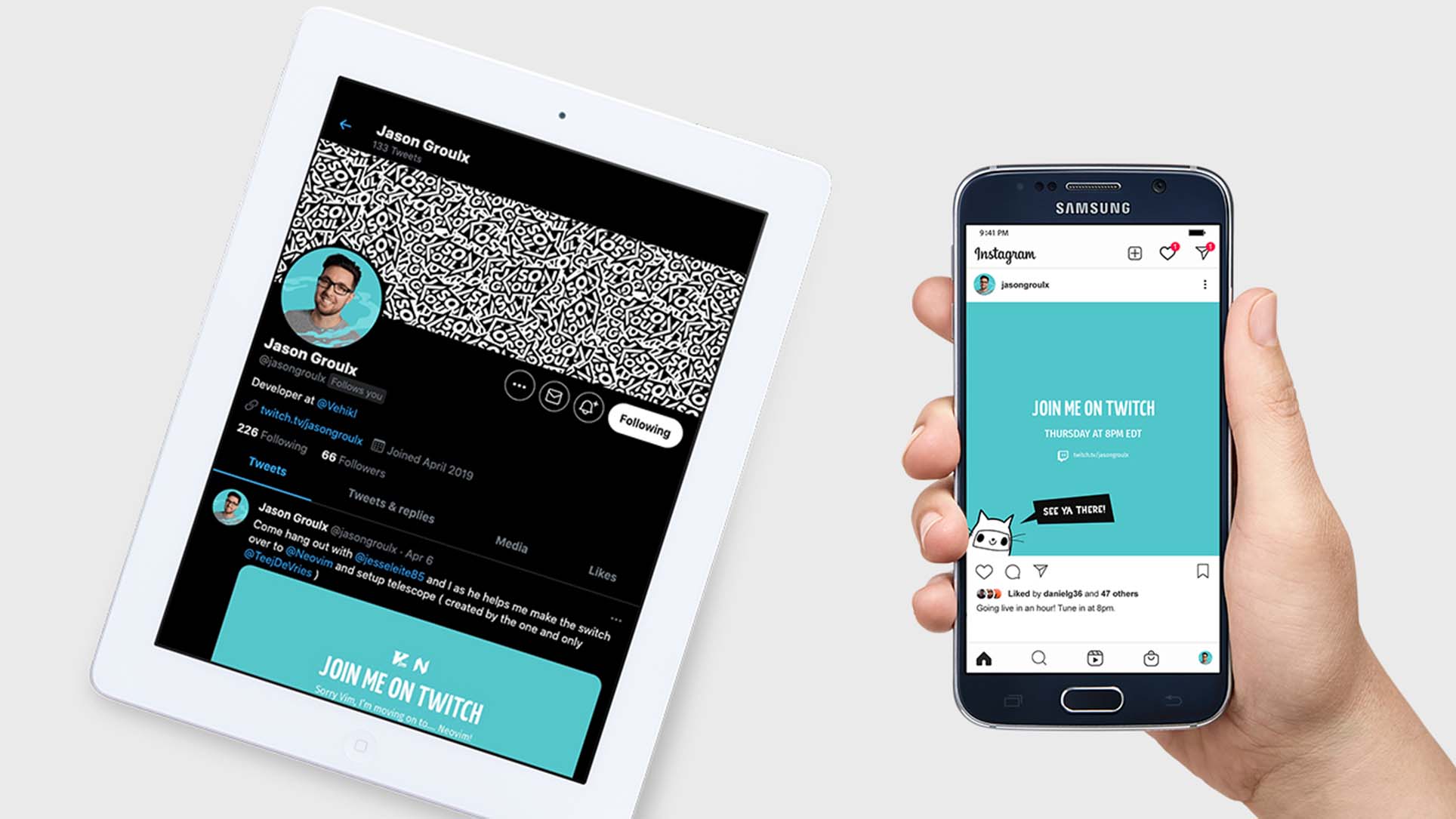
Lastly, I’ve featured some social media graphics that help Jason be easily recognized by developers online across all platforms.

I’m excited to continue working on this brand identity system, as there will be more Twitch design elements to be added in the future. See a brand identity preview video below. View more about my logo and branding packages here.