
30th ANNIVERSARY Campaign
Let’s Talk Science celebrates its 30th anniversary of providing STEM educational programming for Canadian children and youth. Their existing colourful yet professional education branding, infused with playful elements, resonates with both young learners and educators, giving a welcoming and reputable look. To commemorate this huge milestone, I crafted logo variations incorporating ’30’ and the campaign’s pivotal keywords: inspire, educate, innovate. Above all, these logos reinforce Let’s Talk Science’s credibility as a trusted Canadian charitable organization.
MY APPROACH
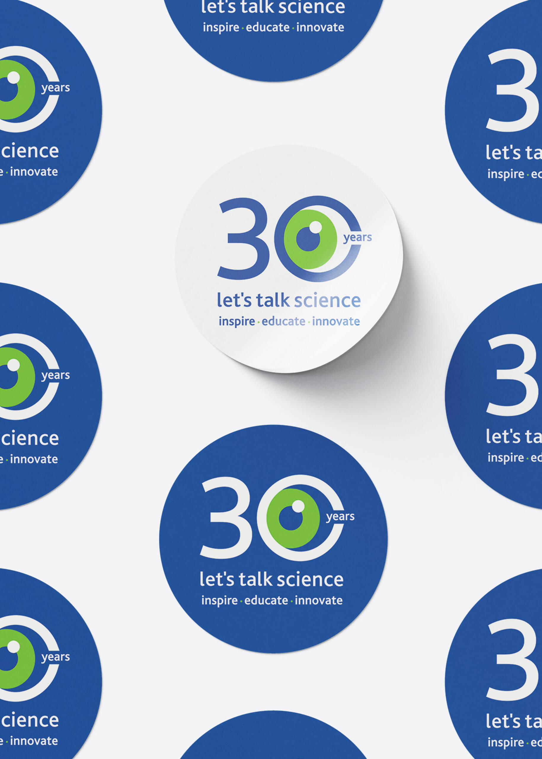
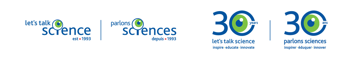
In developing the 30th campaign logos, I ensured alignment with the existing branding. I incorporated iconic imagery such as the magnifying glass/eye motif into the ’30’ logo. I integrated a maple leaf into the ‘est. 1993’ logo, using the signature red brand color. In addition, custom keyword graphics featuring the magnifying glass further enhance brand recognition. As a result, the brand experience is cohesive and seamlessly integrates with Let’s Talk Science’s established identity.
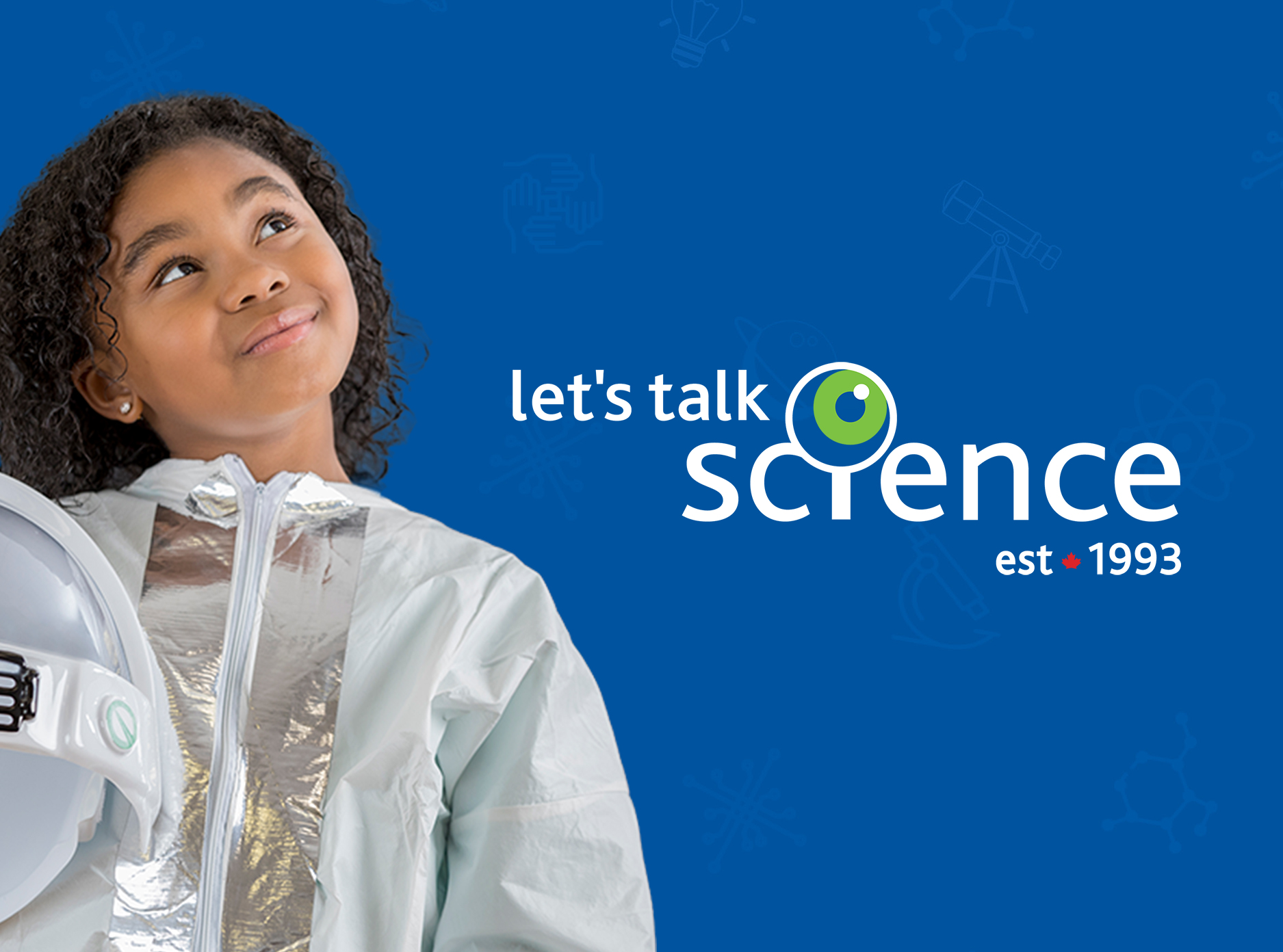
Below, delve into the visual use of the 30th anniversary branding. The bold ’30’ logo exudes strength and longevity, complemented by the fun and recognizable magnifying glass eye. Additionally, the ‘est 1993’ logo with the red maple leaf is ideal for placements requiring a simplified yet impactful look, offering a clean aesthetic.
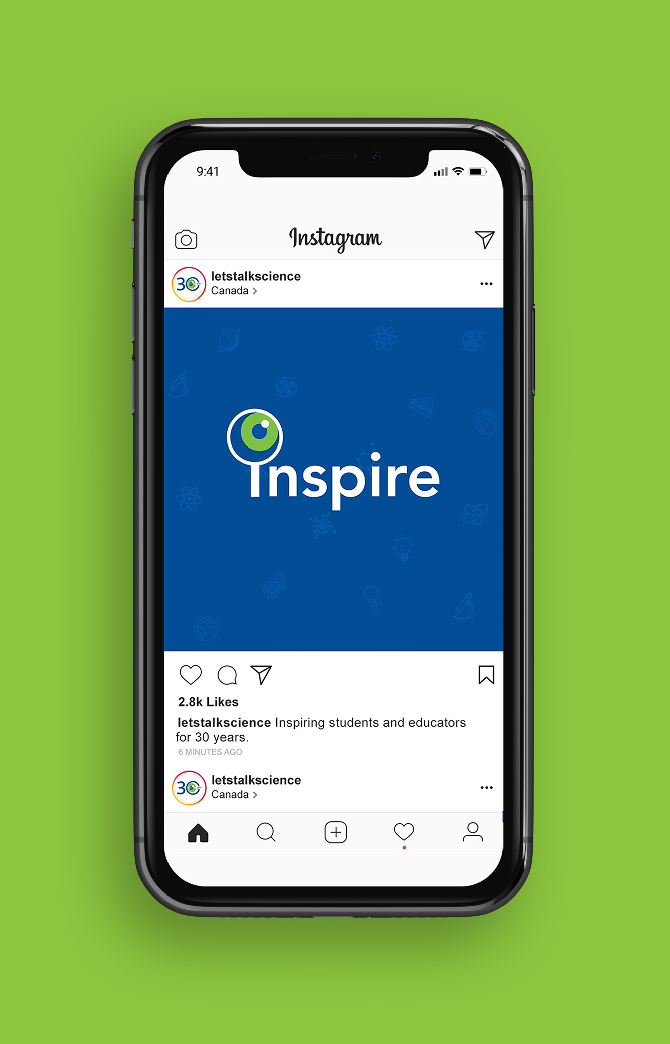
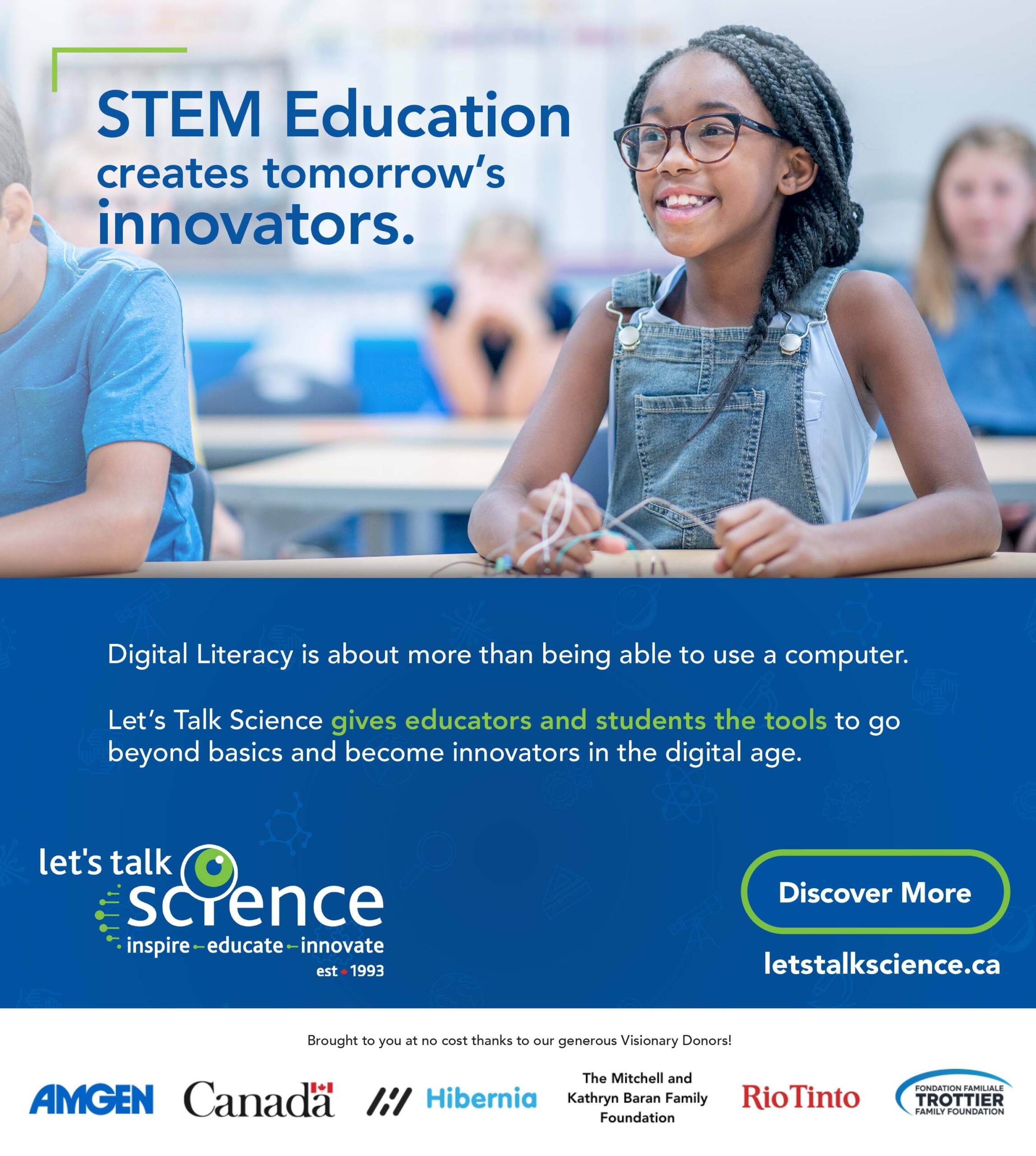
ADVERTISEMENTS + SOCIAL MEDIA
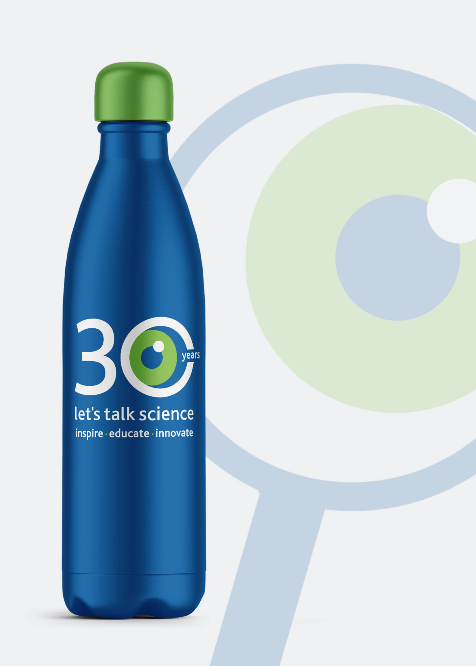
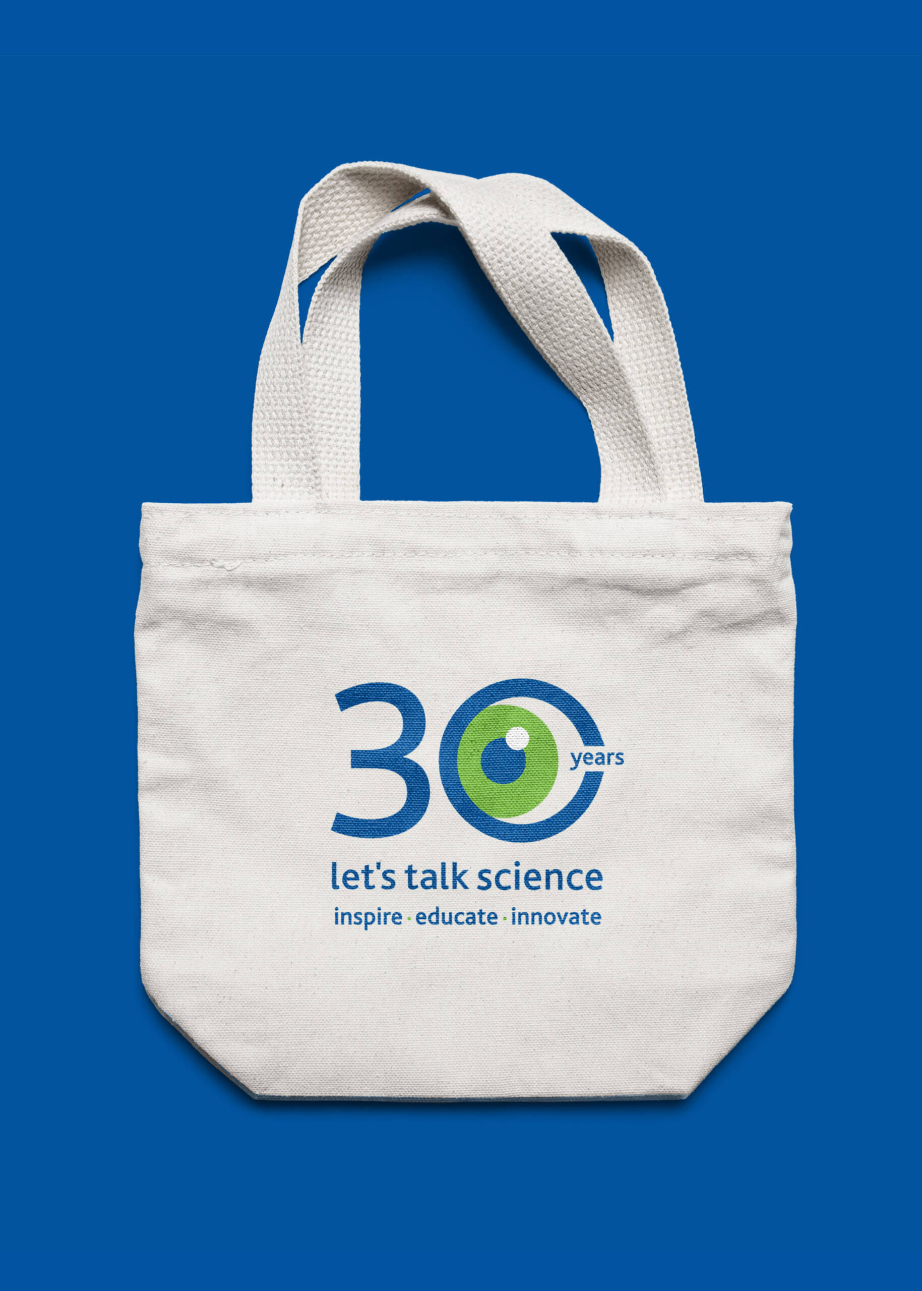
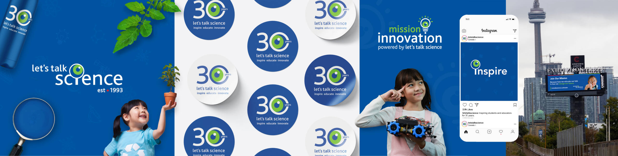
Next, I provide a sneak peek at a range of digital and print advertisements crafted for Let’s Talk Science. These ads showcase their comprehensive programming in digital literacy, innovation, educator resources, and impactful fundraising initiatives. Let’s Talk Science strategically positions them across national publications catering to educators, magazines, educational events, billboards, and video platforms. As you’ll notice, they seamlessly blend with the Let’s Talk Science education branding, creating a cohesive visual experience.


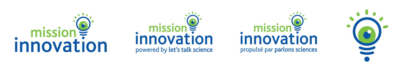
Mission : Innovation Program
Introducing Mission : Innovation, a groundbreaking initiative designed to empower students with vital skills and mindsets essential for becoming true innovators. Developed collaboratively by Let’s Talk Science’s team of educational specialists and teacher advisors nationwide, this project is rooted in human-centered design principles, nurturing curiosity and cultivating critical competencies crucial in today’s fast-paced world of learning.
With Let’s Talk Science’s vibrant blue and green color scheme and professional typography, the goal is to craft a visual identity for the Mission : Innovation program that seamlessly integrates with the existing education branding. The aim is to develop a suite of program logos where each emblem is cohesive with the core branding.
Overall, the Mission : Innovation initiative embodies a spirit of problem-solving, design thinking, innovation, and collaboration, all of which are reflected in the imagery of the new logo.
MY APPROACH
The logo visually represents these principles, symbolizing the brilliance of ideas, insight, and clarity found in these Innovation projects. To accommodate the bilingual naming, I incorporated spaces on both sides of the colon, subtly integrating this punctuation mark into the design of the lightbulb.
Furthermore, the color palette integrates Let’s Talk Science’s signature blue and green hues, adhering to established brand guidelines. By drawing attention to the lightbulb icon, the logo also seamlessly incorporates the brand’s magnifying glass/eye motif, ensuring consistency and fostering brand recognition across all programming endeavors.

FUN, IMPACTFUL EDUCATION BRANDING
Crafting these new logos for Let’s Talk Science presented a fun challenge. I designed them to serve various purposes in advertising, social media, and on their website. Designing visual identities that resonate with the education and youth industries, while incorporating a playful branding approach, always sparks my creativity.
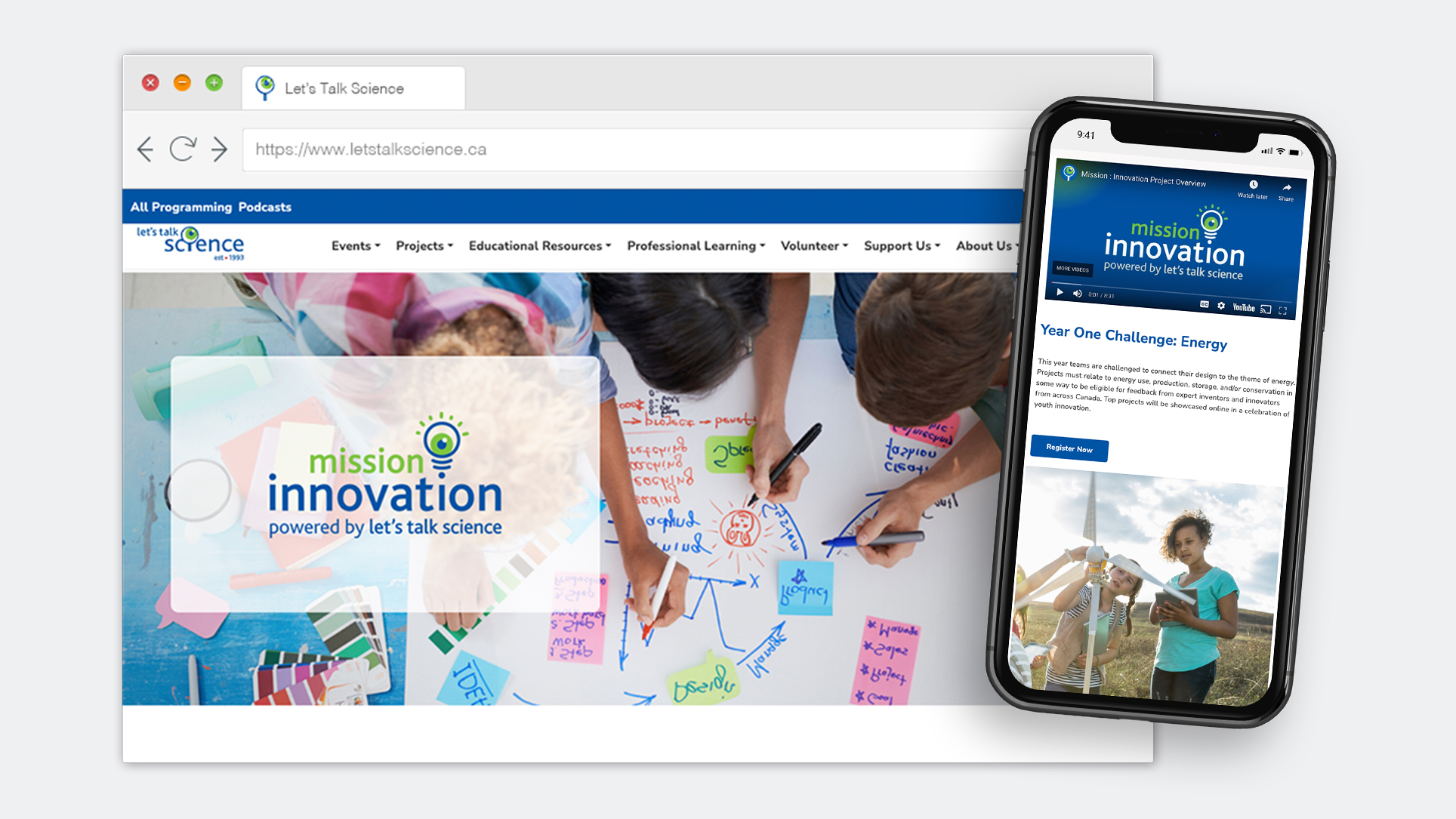
Below, check out the video preview to see Let’s Talk Science designs in action. For full details on their engaging and impactful STEM programming, accessible nationwide in Canada, visit their website.
To learn more about my branding packages, click here.